top of page

EUNIQUELY
NATURAL
BRAND STRATEGY | IDENTITY
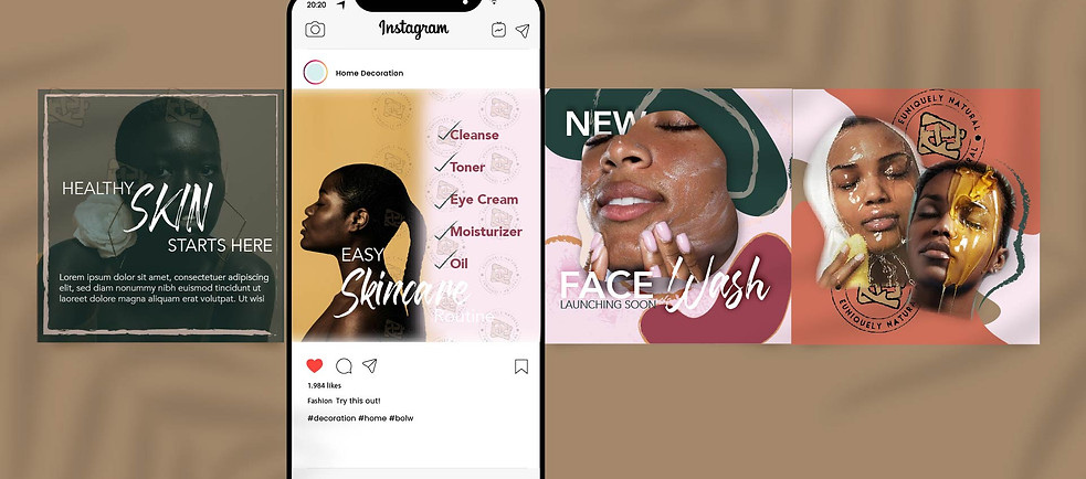
I created the brand identity for Euniquely Natural, a handmade skincare line for W.O.C, with a focus on capturing the essence of artisanal craftsmanship and organic beauty. Using warm colors and hand-drawn line strokes, I aimed to convey a tactile, handmade feel. The logo mark seamlessly combines the letters E and N in an organic manner, symbolizing authenticity and artistry. Additionally, a carefully crafted brand pattern echoes the rhythmic flow of nature, creating a sensorial experience for consumers. In essence, Euniquely Natural is more than a skincare line; it embodies a philosophy of nature's beauty shaped by human hands.


MAIN LOGO
LOGO VARIATIONS


bottom of page